Copic Tutorial: Using Copic Markers to Color Skin Tones
By Colleen Schaan
Gather your Copic markers and join our coloring expert as she shares tips for giving each of your favorite stamped characters a more colorful personality!
Welcome to the first part in a series of articles where I will be sharing tips and tricks for getting the most out of your Copic markers. In this issue, I am focusing on how to color skin, since many of the most popular stamp images today are of people.
Copic markers are alcohol ink markers used by illustrators, designers, cartoonists, and most recently, paper crafters. Copics are smooth, vibrant, blendable and oh-so-fun! While Copic markers are fun to use, there are a few things you need to know before jumping in.
First off, certain Copic colors are formulated to blend more easily with other specific colors. So how do you know which colors work well together? It's easy -- just check out the color code and follow this simple rule: For easiest blending, pick Copic markers that have the same letter (color family), the same first number (saturation) and a two or three digit difference in the last number (shade or value). This will give you markers from the same blending group that are geared to play nicely together. Here's an example of three Copic markers from a good blending group: B01/B04/B07.
Paper and ink compatibility is also important. Not all papers and inks work well with Copic markers. For best results, it is important that you always test both your papers and your inks before beginning to color.
Now that you have the proper supplies and some blendable colors, let's start coloring!
Marker-on-Paper Blending Tutorial
Step 1. Copics work best when blended wet-on-wet, so start by saturating the paper with the lightest color, E00. Color in small circles until the entire area looks smooth. This color will eventually become the highlight. Some people like to leave a small area uncolored to create an even brighter highlight (Photo 1).

Step 2. Add your medium Copic shade E01 to any areas that will not be left as highlights (Photo 2). It makes blending much easier if you apply ink in a flicking motion -- leaving more ink at the beginning of the stroke.

Step 3. Blend the light E00 and the medium E01 shades together using the light marker E00. Color in small circles or flick where the two colors meet to blend smoothly (Photo 3).

Step 4. Apply more shading with the darkest Copic color, E11 (Photo 4).

Step 5. Blend the area between the dark E11 and medium E01 colors together with the medium color E01. TIP: Focus on blending only two Copic colors together at a time. Always use the lighter of the two to blend (Photo 5).

Step 6. Finish the blend with the lightest Copic color E00 to smooth everything out. Don't use too much light ink or you will lighten up the darker shades. If necessary, add more dark ink and continue blending.
Your image is probably pretty good right now. You might think you are finished, but there are two or three additional things you can do when coloring skin tones to make your images come alive.
Step 7. Once the colored image is dry, use a soft purple BV00 to add hard shadows. Don't blend this final shading (Photo 6).

Just look at the difference this one simple step makes in giving your image a more lifelike appearance.
To take your image one step further, you can add a touch of blush to the cheeks. This works especially well with infant and child images. To avoid blobs of bright color, select a red or pink that is just slightly darker than your image skin tone.
Step 8. Lightly brush color R02 onto each cheek. Immediately blend with the medium skin-color marker by tapping around the outside of the cheeks. TIP: Don't use the Copic colorless blender for this, or you will wash out the face tone also. If you have shadows on the face, make sure to use the color of the skin tone from under each individual cheek area (Photo 7).

Step 9. As the last step, use the colorless blender to pull some more highlights to create contrast.
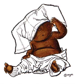
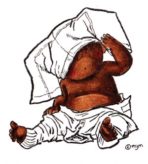
Sometimes we get stuck in a rut, and all of our images become reflections of ourselves. Break out of that rut and start populating your crafty projects with a variety of skin tones. Experiment with some of the combinations on the following page.
Other Skin Tones


TIP: The darker the Copic shade, the less color you will need to use. Using too much of the darker shades will obscure details and diminish contrast.
This Copic tutorial was first published in the March 2011 issue of CardMaker magazine. To get more information on Copic marker techniques:
- Purchase a copy of Colleen's book Copic Coloring Guide.
- Check out Colleen's blog, www.distinctivetouches.com.
- Subscribe to CardMaker magazine, where Colleen has a regular column featuring Copic marker techniques.


