
Copic Tutorial - Pointillism
By Colleen Schaan
A beautiful array of ink colors, a light touch, and a little patience are all you need to master this approach to coloring your favorite images.
One of my favorite things about autumn is all of the beautiful hues! I love to see nature's mix of reds and oranges and yellows, all combined to paint the landscape in a riot of color.
In this Copic coloring tutorial, we'll be covering pointillism, a fun technique that relies on its own mixing of color to create vivid scenes.
Pointillism is an age-old painting technique where small strokes or dots of color are applied to a surface so that when viewed from a distance, they blend together. In very strict terms, the dots are made up of primary colors, whose placement allows the eye to "create" a new hue. For example, blue and yellow dots are placed near each other or overlapping to make the eye see green.
For this article, I won't be quite that strict. Instead, I'd like to share how I interpret pointillism in my coloring projects.
Step 1: Begin with the lightest color (YR31) and apply tiny dots to the highlight area. Notice how the highlight area is outlined first with dots and then filled in (Photo 1).
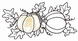
Step 2: Fill in all the highlight areas with dots of the lightest colors (YR31, YG21). Make sure to leave space in between each dot to avoid blending them together. Let dry completely (Photo 2).
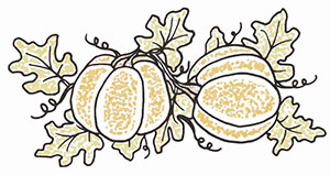
Step 3: Begin adding dots of the medium color (YR12). Notice how the dots near the edges are more condensed, and the dots in the highlight area are more spread out. Let dry completely (Photo 3).
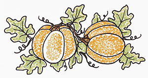
Step 4: Continue adding dots with a dark color (YR68). Again, make the area around the edges darker by having the dots closer together. Spread the dots out as you move toward the highlight area. Let dry completely (Photo 4).
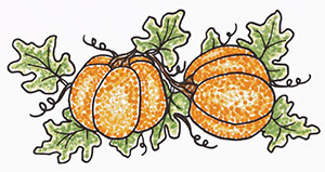
Step 5: Repeat step 4 as often as necessary with a darker color (YR27). This will add the appearance of volume and shading. Let dry completely (Photo 5).
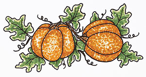
Step 6: Add very tiny dots of a complementary color (B95) to create the look of cast shadows. Do not add any dots of this color to the medium or light areas (Photo 6).
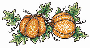
Step 7: Using small dots, add background "shading" with a variety of colors (E30, E23, B91 and B95). Keep the dots closest to the image darker and use lighter colors farther away (Photo 7).
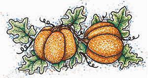
While this technique takes time and patience, the results are well worth the effort. Be spot-on with your next Copic coloring project by giving the pointillism technique a try.
*Stamp image used for tutorial is Autumn Beauty by Sweet 'n Sassy Stamps. See project tutorial on next page for a complete list of Copic® colors used.
- Use the very tip of the brush nib to create tiny dots.
- Hold the marker straight up and down.
- Tap marker lightly on the surface; do not press down.
- Make dots as small as possible.
- Avoid making dots in lines or patterns; be random.
- Always start with the lightest color first or the dots will begin to blend.
- Let each layer dry completely to avoid blending the dots.
- Do NOT blend colors.
- Use colors that are close in shade to create the appearance of blending.
- Overlap colors to create the appearance of blending.
- Be patient; don't rush.
- Relax your hand.
- Take breaks.
This Copic tutorial was first published in the Autumn 2013 issue of CardMaker magazine. To get more information on Copic marker techniques:
- Purchase a copy of Colleen's book Copic Coloring Guide.
- Check out Colleen's blog, www.distinctivetouches.com.
- Subscribe to CardMaker magazine, where Colleen has a regular column featuring Copic marker techniques.


